A Blindfolded Model on the 2026 World Cup Final
On final day I wanted a forecast that could not cheat. No team names, no star players, no injury chatter, no odds board. Just tournament rates, an Elo gap, and the fact that this was the highest-intensity match in the sport. The model still picked a favorite.
to win it all
goals A-B
finished score
if anyone scores
The rule: keep the blindfold on
Football forecasting usually starts with names. Messi. Yamal. A coach’s reputation. A newspaper narrative about destiny. Those things may matter in life. They also make it easy to smuggle bias into a “model.”
So the stack was intentionally dumb about identity. Two sides labeled A and B. World Football Elo ratings from the day before. Goals scored and conceded per match in this tournament. Neutral venue. Maximum knockout intensity. Nothing else.
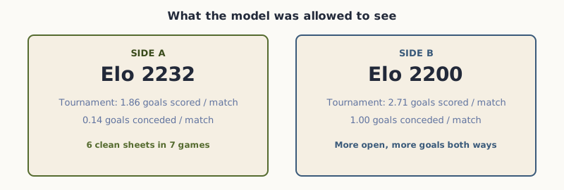
Side A: slightly higher Elo, almost no goals conceded. Side B: more goals for, and more goals against.
What it found
Over 100,000 simulated cup paths (regulation, then extra time, then penalties if needed), Side A lifts the trophy about 62% of the time. Side B still wins more than one time in three. That is a favorite, not a prophecy.
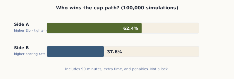
Full knockout path, not just 90 minutes.
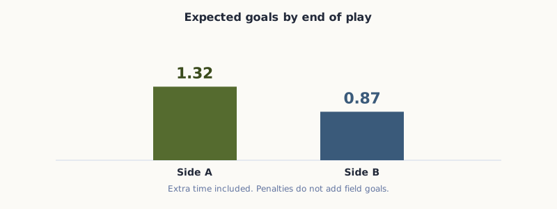
Expected end-of-play goals sit near 1.3 to 0.9. Finals stay tight.
| Question | Blind answer |
|---|---|
| Winner | Side A · 62.4% |
| Goals (expected) | A 1.32 · B 0.87 |
| Winning margin (in open play) | about 1.5 goals |
| First to score (if anyone does) | Side A · ~60% |
| Most common finished score | 1-0 to A |
Scorelines and the long way home
The single most likely 90-minute cell is a 0-0. That is the low-scoring final pattern talking. Once extra time and penalties enter, the mass shifts toward 1-0 for A. About one third of simulations still need something after the whistle.
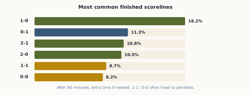
Finished scores after the full path. 1-1 and 0-0 often mean pens.
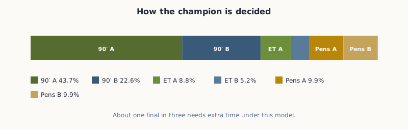
Roughly 44% A in 90 minutes, 23% B in 90 minutes, the rest in ET or pens.
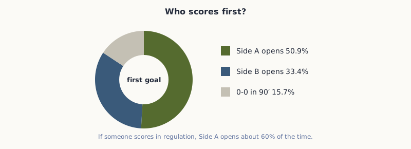
First goal is a rate race. A’s scoring rate still edges B’s even after shrinkage.
Why A, without telling a story
The Elo gap is small: 32 points. That alone is a lean, not a rout. The bigger shove is defensive rate. Side A has barely conceded in this tournament. Side B has scored more, but also leaks more. Tournament samples are short (seven games each), so the model only gives form about a quarter of the weight and leans the rest on Elo. That stops “one goal conceded in seven” from becoming a law of physics.
Intensity is dialed to maximum and then slightly damped for final tightness. Markets never enter. News never enters. Player names never enter.
What favors A
Higher Elo, extreme clean-sheet rate, lower expected goals against once form is shrunk toward the mean.
What keeps B alive
Higher scoring rate, knockout variance, and a one-in-three path through ET or pens where coin-flip mass grows.
Open the envelope
Identity map (operator key)
So the blind forecast says Spain is the favorite on final day, with a low-scoring shape and a real chance that the holders still spoil it. If you want the vibes version of this match, there are thousands of previews. This page is the other product: a sealed forecast that only looked at rates.
What I left out on purpose
Bookmaker prices, TV panels, and social timelines all know who is playing. That knowledge is useful for entertainment. It is also a shortcut that can wash out the statistical question I cared about: if you only know strength rates and stage intensity, who still looks better?
I also skipped club form beyond what Elo already encodes, skipped starting XIs, and skipped any coach reputation score that would re-introduce a name through the back door. The cost is obvious. The gain is a forecast you can read as a pure rate story.
A note on the math, without the textbook
Under the hood this is a standard sports stack: Elo maps to expected goals, tournament attack and defense rates get blended in with heavy shrinkage, low scores get a small dependence tweak so 0-0 and 1-1 are not underpriced, then the match is simulated to a champion. You do not need the formulas to use the charts. The point is that none of those steps required a jersey color.
Historical World Cup finals already tend to score less than the group-stage circus. The model leans into that with a mild final damper. That is why the expected goals look modest even when one side has been freer in the knockout rounds.
How much to trust it
Soccer is a low-scoring sport. A 62% favorite still loses often. The model is a classic Elo plus attack/defense plus low-score adjustment stack, not a claim that history will repeat. It also refuses the two strongest modern cheating tools in sports content: the odds board and the injury rumor mill.
If the final is open and ugly, that does not "break" the chart. The chart already put about 38% on the other flag.
Read the page as a sealed-envelope experiment, not as a betting tip. If Spain win 1-0, the blind model looked ordinary. If Argentina win on penalties, the model already priced a large minority path. Either way you get a cleaner story than a preview that starts with the star names and works backward.
I will watch the final with the same nerves as everyone else. The charts are just a second set of eyes that never learned the jerseys.